Enel X Connect
Energy consumption & bill management application
Enel X Connect
Redefining EnerNoc’s Utility Bill Management experience (X Connect)
I was part of an ambitious project to redefine the new set of applications that would meet the market expansion standards that Enel was expecting.
- I worked as a Senior Designer, and used lean agile methodology to improve efficiency while focusing on customer value.
- The design of XConnect application took 14 months from start to finish and involved a team of 2 senior designers and 3 interns.
- Application was shipped to production in 2020 and is still being used today by Enel customers from US.
Business goals
Utility Bill Management (UBM) with Demand Response (DR) and among a few other applications were the most vital energy management applications at Enel X former EnerNoc. Through the years, the interaction model failed to meet users needs which required Data visualisation and Custom energy reporting among other important features. The initial business goals were to evaluate the entire suite of applications that EnerNoc had and to focus on redesigning the ones that bring the most revenue.
My involvement
I was initially hired to help improve the usability of UBM application while collaborating closely with the engineering team. After the scope of the business and goals have changed I received more responsibility and was personally in charge of:
- Running heuristic analysis to help solve current UI issues
- Researching Enel’s main competitors from the US energy market and document the findings
- The co-creation of the new design system and maintenance while collaborating closely with engineering team
- Data visualisation mock-ups and Prototyping
- Held Contextual interviews and Usability Testing sessions
- Workshop and presentations to internal teams (Product management)
- Collaborated and supported engineering teams from Italy, India and US
- Reviewed/validated design implementation along with engineering team
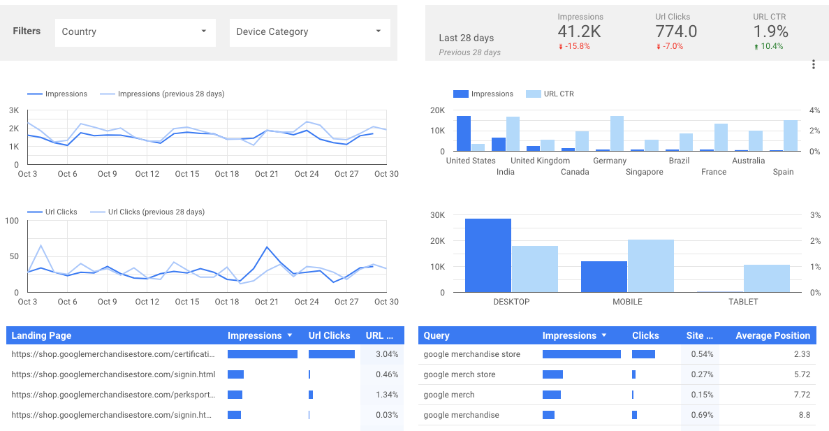
- Measured results and performance of final product using google analytics and contextual interviews
1. First thoughts: Heuristic analysis
With the new management team and the expanding user base, the customers asked for features that the current interface wasn’t able to deliver. When I was first introduced to UBM, I noticed there were a number of design and functional flaws:
- Very small font size, considering most users were over 40 years old
- Missing of critical navigation functionality to find certain data (users had to click multiple times to get to a specific page)
- Users had to log in with same account on different Enel applications to compare data
- Filtering for specific results required heavy cognitive load
- Reporting feature was very cluttered and required horizontal scrolling
- Missing data visualisation (customers had to use different application to generate charts based on their data)
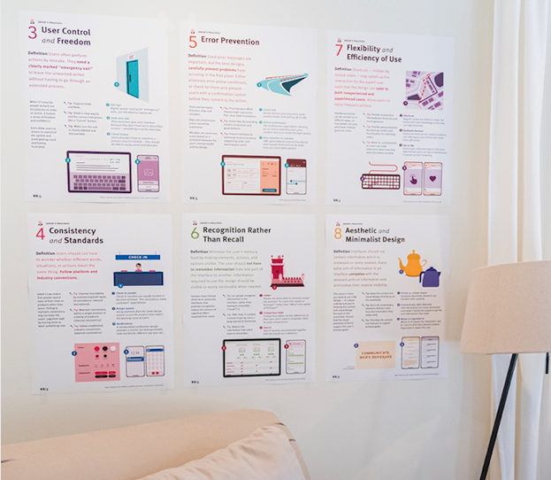
To get these findings documented and get more insights on what wasn’t working for the users, I ran a Heuristic analysis following Nielsen Norman 10 general principles for interaction design. This was an important step towards improving and maintaining the current UBM application.
2. Understanding users: Personas document
Since the goal of the business has changed and the new direction was towards creation of a Unified Platform (XConnect) that would embed all the legacy applications, I received more responsibilities and became part of the advisory board.
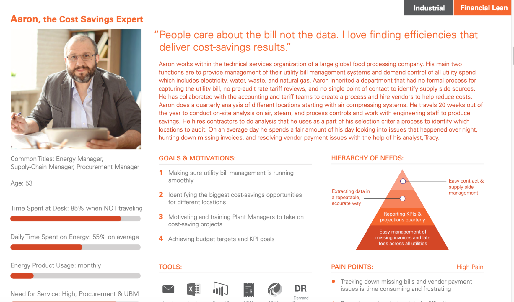
In order to better understand our users and their day to day activity and tasks we created a personas document. This document was generated based on contextual interviews with UBM users with different roles within a company. These users were Financial experts, Property managers and Data analysts.

3. See what competition is doing: Competitive analysis
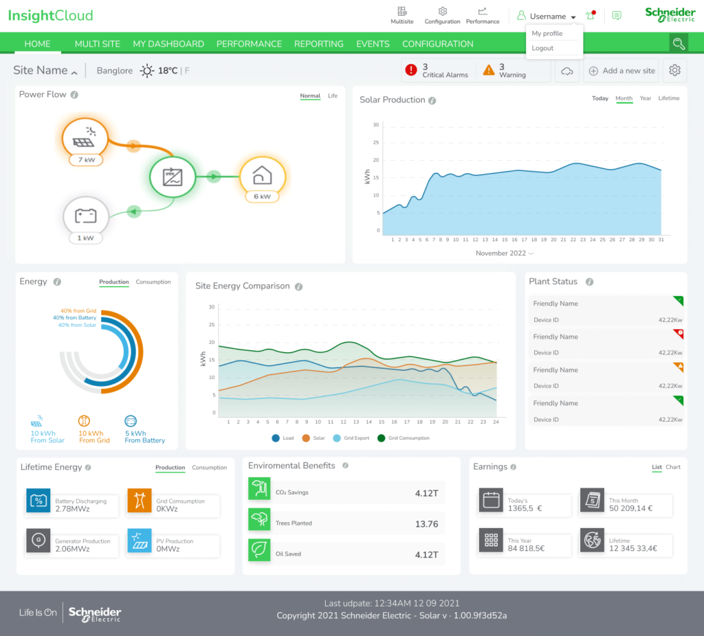
Before starting on the design of the new unified platform called XConnect, I wanted to see how other Energy companies from US are handling energy data management and customer expectations. The main focus of the analysis was:
- Data organisation & page layout structure
- Reporting & data visualisation
- Customer support area
Some of the main energy companies that I explored were E-On, Engie and Schneider Electric. Analysing competitors interfaces helped us get a better picture of what the legacy application was lacking and what can be improved.
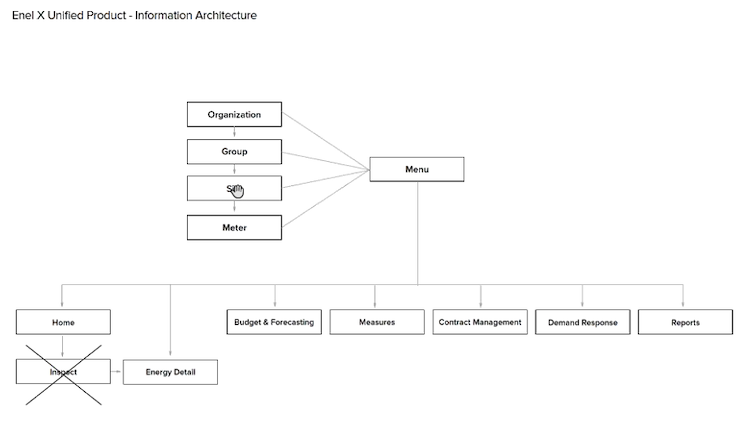
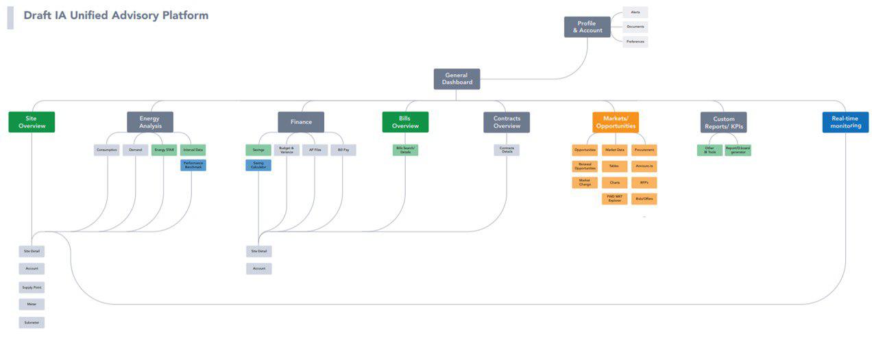
Based on the findings and discussions with the Product team, we created the Information Architecture map that would be the backbone and point of reference for the XConnect application.
4. Defining design goals and roadmap: Prioritisation Matrix
I wanted to start the project with a clear set of rules that would define the new application. Some of the most important aspects that I wanted to achieve were confirmed during the customers interviews and research findings.
I order to decide which feature would have the most impact on the user experience, I used a Priority Matrix and collaborated with engineering and product management teams to define a roadmap and clear timeline for implementation.
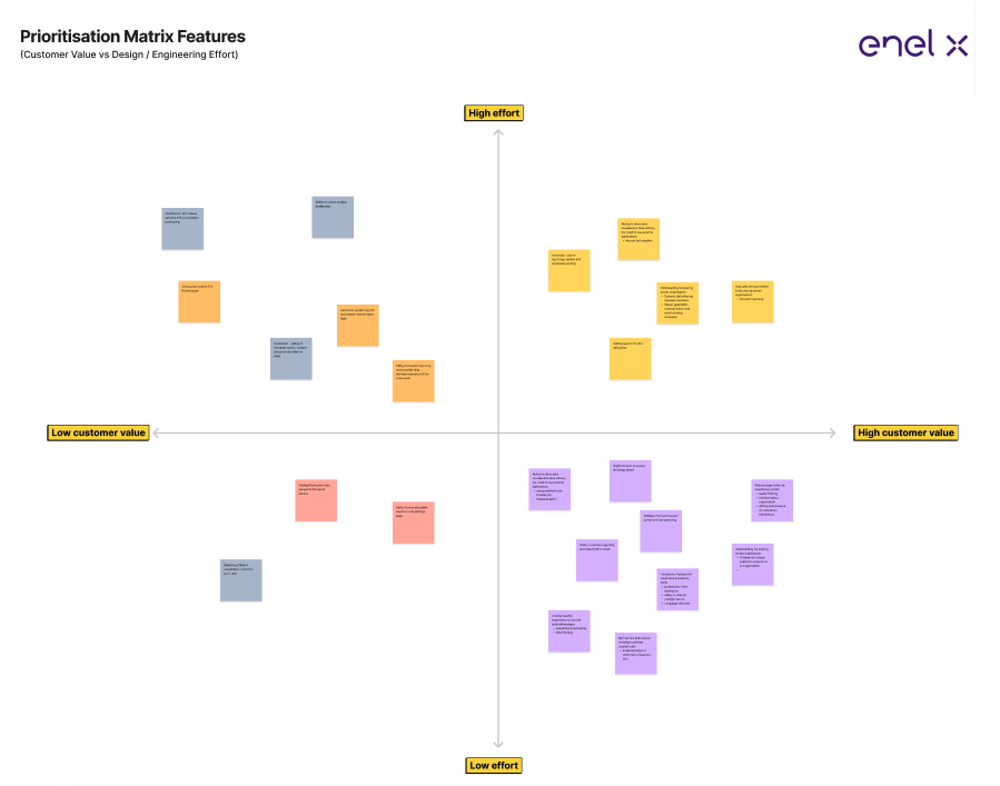
The features prioritised from this meeting were the ones that required the least effort from engineering team and had the highest impact on the user experience.
These features were:
1. Ability to self-service custom data without the need to use external applications:
- Implementation of data visualisation and custom report creation within the application without the need to use external software (ex. Microsoft BI).
- Used third-party software (Looker) and customised it to match Enel’s branding colors, for a seamless user experience.

2. Minimal data per page for less cognitive load:
- Customers needed to navigate with ease and find the information they were looking for effortlessly.
- Redefined the new UI page layout in an F-pattern while prioritising the content in a parent-child structure, for easier page scanning and faster interactions.
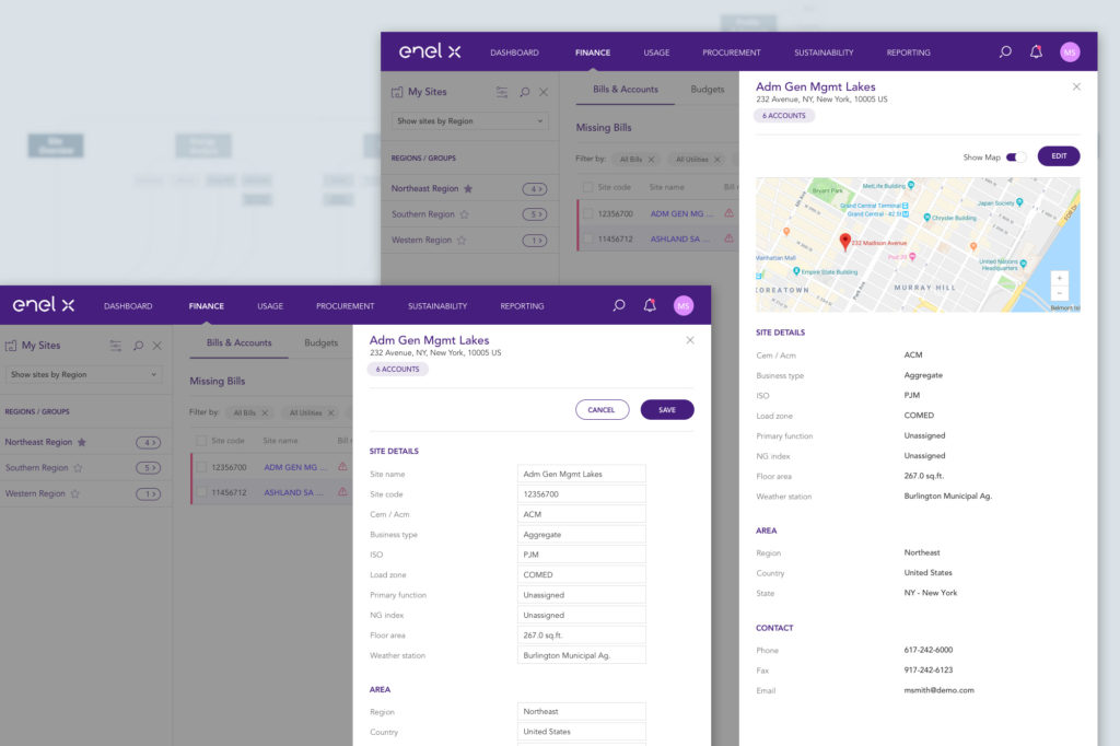
- Suggested use of side drawers for secondary interactions to minimise cognitive load.
- Improved filtering system.
3. A faster loading experience across the application pages:
- Collaborated with engineering team and implemented sequential data loading per page in a parent-child structure.
- Designed a Filtering and Favourite component in order to minimize the page loading time and also improve the user experience for loading heavy data (between 500-1000 sites).
- Added descriptive loading for each of the main components, in order to maintain user engaged and informed.
4. Improving search and data finding:
- Suggested a dynamic search box that would help users find easily the information they are looking for
- Designed a 1 row minimal filtering system that saved vertical space, allowing more space for energy data
5. Implementing file sharing across organisation:
- Creation of multiple customer accounts in an organisation
- Static and dynamic data sharing between members
- Report generation automatization and email sending scheduler
6. Self-service help area to reduce customer support calls:
- Designed a support library that can be managed by support team
- Implemented Intercom customer service application to better support customers queries
7. Localisation features for customers around the world:
- Showing content in the customer’s language
- Collaborated with engineering team to implement automatic detection of client’s IP and showing energy data in the metric or imperial system
5. Components & Consistency
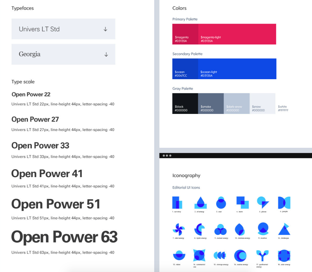
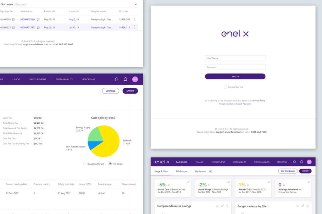
In order to have a consistent experience for the entire application, I collaborated with the rest of the design team and front-end engineering lead to create a Design System that would help us maintain consistency across the application. The new design system was based on the Enel branding manual, and it was adapted to the internal application needs with custom components created by me and the design team.
6. Prototyping & Usability testing
To get realtime insights and validate new features quickly, we had usability testing sessions every 2 weeks with different Enel customers. This helped us make faster decisions on the new design features and avoid rework on some more complex user flows.
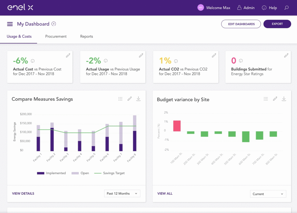
Some of the first pages that were tested with the users were the Dashboard which offered a cards layout that can be customisable based on users content priorities. This was a new feature that the customers liked especially since each of them had different roles within their company.
Other pages that were tested in usability sessions were the Billing, Budgets, Payments and Savings.
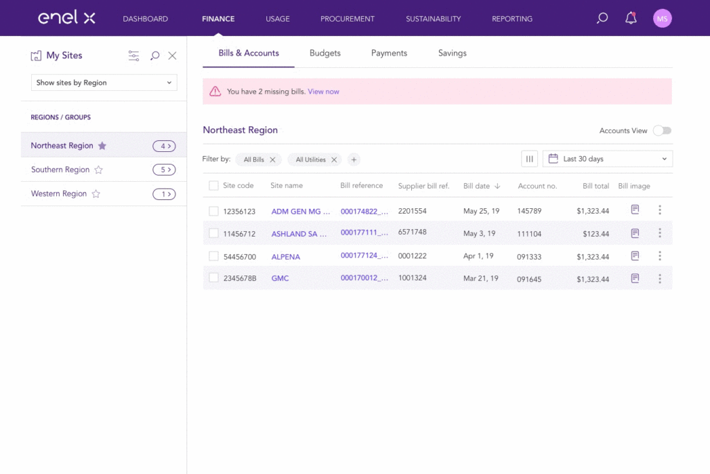
Viewing site’s address and editing in a side drawer.
Dashboard interactions:
- Exporting a report
- Editing card’s data
- Viewing data with different charts
Challenges:
1. Delayed timeline due to change of scope
Since EnerNoc (former company) had a couple of applications that generating revenue, the initial scope of the design team was to evaluate these softwares and try to improve the UI while also adding more features. This process took around 3 months. After this period the Product management decided to create a brand new application called XConnect that would incorporate all the features of those products. This change of scope has delayed the design process and initial lunch of the new product.
2. Collaborating on 4 different time zones
Because the teams were on 3 different time zones (Boston, Rome, Bucharest, Mumbai) it was difficult at times to get ask questions and receive answers right away. We had an overlap time of approximate 4 hours where all the teams were able to join the same meeting and discuss urgent topics. For the design work I suggested we use Trello for better collaboration with the Product managers and also ability to work asynchronously.
3. Hand-off and Implementation
The collaboration between design and engineering was difficult most of the times. Handing over the design files to engineering required extra effort from my side and the design team, in order to show the correct dimensions, boundries and correct alignment of each component. Even with these guides, the engineering was not implementing the designs as expected most of the times. This is why I suggested we start using Zeplin in order to solve this problem. Zeplin helped us reduce the design work needed to create the implementation guides and also provided to engineering team all the details needed. Also there was no need for design to export icons, logos and other graphics to hand them over, since they could export it themselves from Zeplin.
Key takeaways
The new application XConnect was an innovative and facile system that received very positive feedback from the Enel customers from North America.
Some of the things learned during this process were:
- The creation of the personas document based on users feedback helped the design team create a clear set of features that were expected by the users
- Analysing the prototypes in usability testing sessions helped us improve the UI
- The energy market competitive document has helped to better understand what we are missing and to design a competitive application
- The UI heuristic analysis helped us to quickly see what is not working in current interface and make changes accordingly
- Working remotely with teams from different timezones (Mumbai, Bucharest, Rome and Boston) was a challenging sometimes
