
Paychex
Health and Benefits management application
Paychex
Redesigning the Health & Benefits legacy application
Through the years, the Paychex’s Health & Benefits application became dated and required a lot of customer support calls from the customers in order to finalise the onboarding process. Customers also faced a lot of technical issues from browsers incompatibility to errors due to incorrect data entry.
My involvement
I worked as Senior Product Designer along with the Paychex team to enhance the Health & Benefits application to a more robust and user-friendly interface. When designing we used a user-centered vision and followed closely activity heat maps provided by Google.
I was personally in charge of:
- Wireframes & Prototyping
- Visual design
- User testing and internal team interviews
Research process and user testing
The one year long redesign process included UX team collaboration with Paychex team which provided context for the redesign and major user pain-points that needed to be addressed.
I started the research process by running a competitive analysis, researching QuickBooks, Turbotax and a few other applications that dealt with finances and insurance. The research provided some key insights on the way the new application should look and feel to the user. We wanted that the new H&B application to speak the user language, be visually appealing and have imagery to explain as much as possible the page content before reading.
On the technological side we wanted the application to be very fast and also avoid errors as much as possible, by validating inputs in real time.
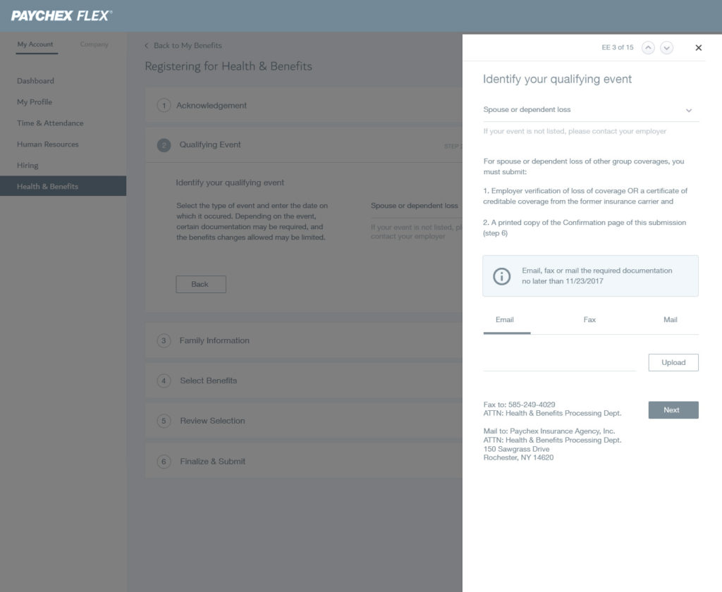
Wireframes
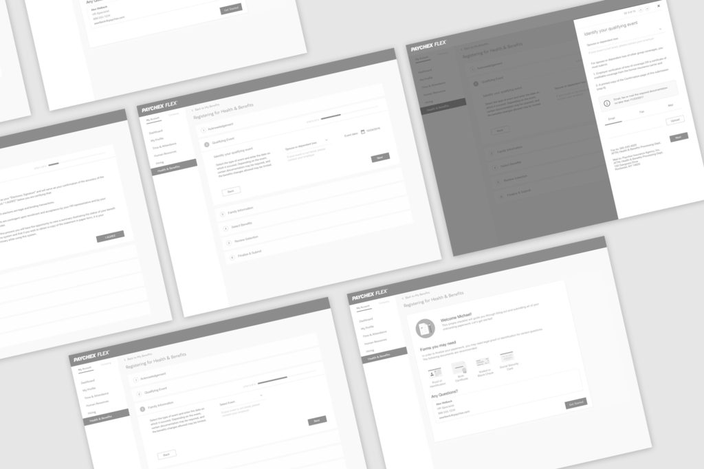
Initial wireframes were done in order to test and validate general structure and user journey.
Visual design
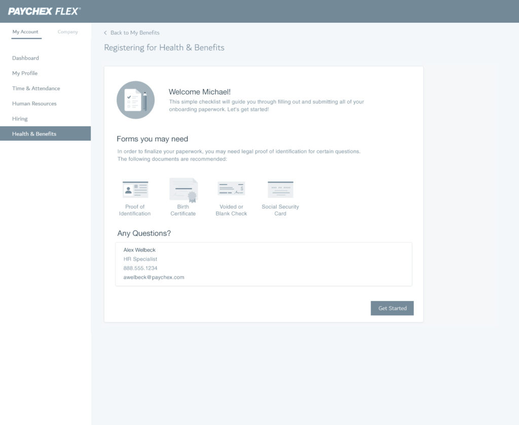
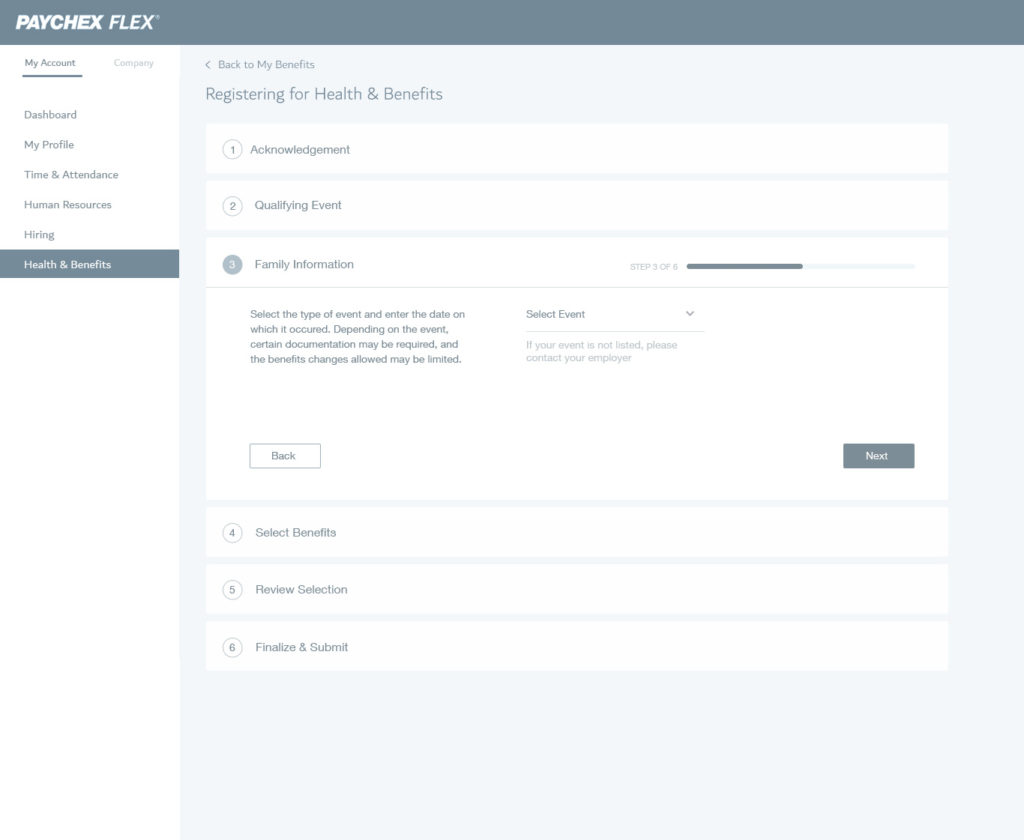
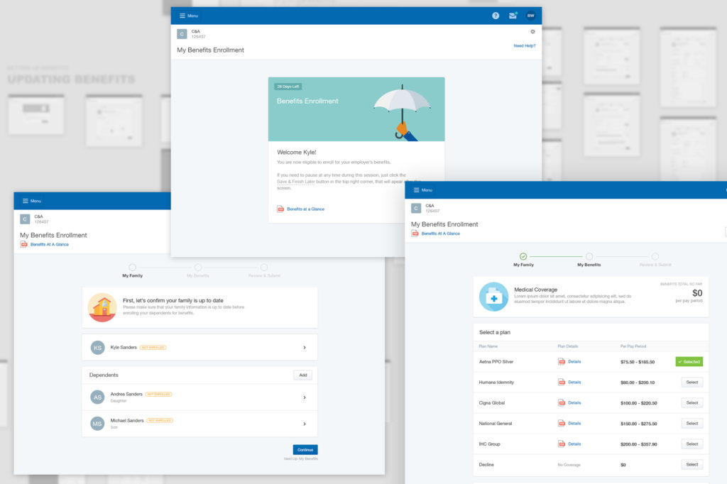
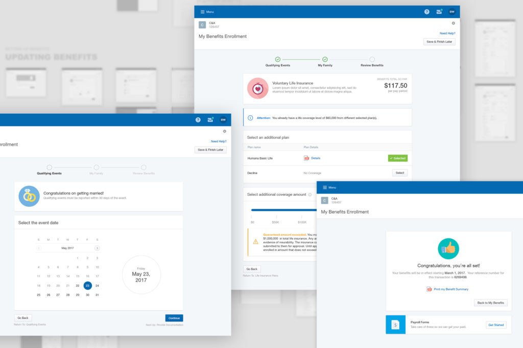
After a few iterations we received positive feedback from Paychex team and moved to visual design. The new design was tested with the larger team and actual Health & Benefits users.
Conclusion
The new Health & Benefits application was a success that was validated by:
- the user data tracking provided by Google (80% increase in onboarding process completion)
- Paychex support team which had x3 time less calls from customers.
- The contextual user interviews after the new version was implemented
Info
Client:
Project:
Paychex Health & Benefits
Duration:
11 Months